-
Role
Product design
-
Duration
6 days
-
Deliverables
Low-fidility wireframes
This is a design challenge given by Shopify.
The Challenge (given)
Some new touchscreen parking meters are being installed throughout your city (Vancouver, in my case). There is one meter for every 6 parking spots. Design the touchscreen interface so that drivers can pay for their parking spot for a certain duration, and parking attendants can give tickets to cars who do not pay, or whose parking has expired.
Constraints
The machine has a single touchscreen. There isn't any kind of pinch and zoom, hard press or advanced touchscreen functionality supported.
The parking meters can accept credit card payments, but are not otherwise connected to the internet and are not Bluetooth enabled.
Goals
In this scenario, I'm designing for the city of Vancouver. Before diving into the design process, let's clarify the goals and objectives.
Business goals
As the British Colombia government, main business goals for this project will be to:
- Maintain a smooth flow of traffic throughout Vancouver
- Manage parking to balance the needs of residents, commuters, and visitors
Reference: City of Vancouver website
Product objectives
The new parking meters should:
- Have a system that is usable, accessible, and useful to drivers and also parking attendants
- Make the car parking process easier while keeping a high level of security
The Process
For this design project, I took those steps below to design a user-centred product.
- Research & Empathize: current state, field study, user interview
- Define & Ideate: personas, user flow, task flow, assumptions
- Design: sketch, wireframe, prototype
- Usability testing & Iterate: usability testing, iterate
1. Research & Empathize
My first step was to do some research and user interviews to empathize with the current users and understand the problems.
Current state
- Parking meters
In Vancouver, there are several kinds of parking meters installed, and the meter rates vary throughout the city depending on the user data of the previous year.
For payments, relatively newly installed meters accept coins, credit cards, and the PayByPhone app while old ones don’t accept credit card payment. If drivers use the PayByPhone app/website, they can complete payments within the app/website.
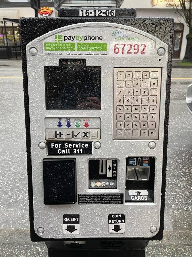
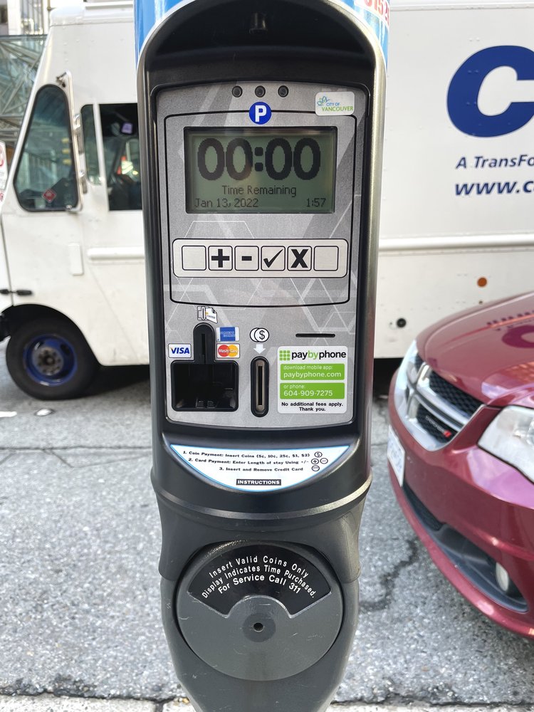
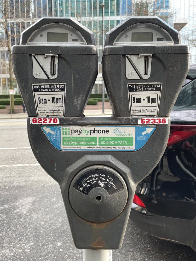
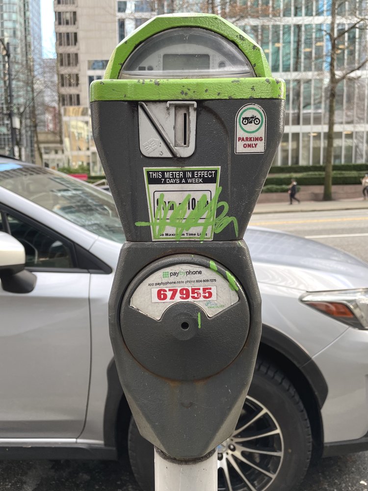
Parking meters installed in downtown Vancouver
- Parking in the city
People have some options of where they can park in downtown Vancouver; 1) free street parking, 2) street metered parking, 3) public pay parking lot, 4) parking lot at shopping malls. Bus and train are very commonly used in the city as well.
- Other
In Vancouver, as it’s called “Raincouver“, it rains a lot in winter.
Quick field study
On day 2, I brought myself on the street downtown to observe how people use the parking meter currently installed there.
It was a rainy and cold day (as usual), and I could see 2 drivers complete the process of street metered parking. I witnessed both of them were taking around 4 minutes to complete the payment
User interview
I conducted user interviews with 6 people to find out what they feel and where they think there are issues when using a parking meter. I asked them some questions like;
- How do you usually pay in your everyday life? And why do you do so?
- When you decide where to park downtown, what do you think about?
- (Showing pictures of meters) Which kind of meters do you like the most and the least? Why are they the best/the worst for you?
- Tell me about your worst experience with parking downtown and what you were feeling during the experience.
And I found some problems with the current user experience. You can see the full data of the user interview in this sheet.
Note
For this project, I tried to interview a parking attendant as well, but unfortunately, I couldn’t find one. Hence, I will proceed with a hypothesis for the parking attendants’ usability.
2. Define & Ideate
From the research results, I defined the problems. The biggest problems that should be solved are;
- Complex parking meter design slows down the payment process
- When one parking meter covers a group of parking spots, users sometimes have to wait for other people to finish the payment at the meter.
- Some people don’t know where to start but some meters don’t clearly show instructions on it.
- Normal touchscreens can be hard to see and properly respond outdoors depending on the weather condition. (Especially in Vancouver, it rains a lot in winter.)
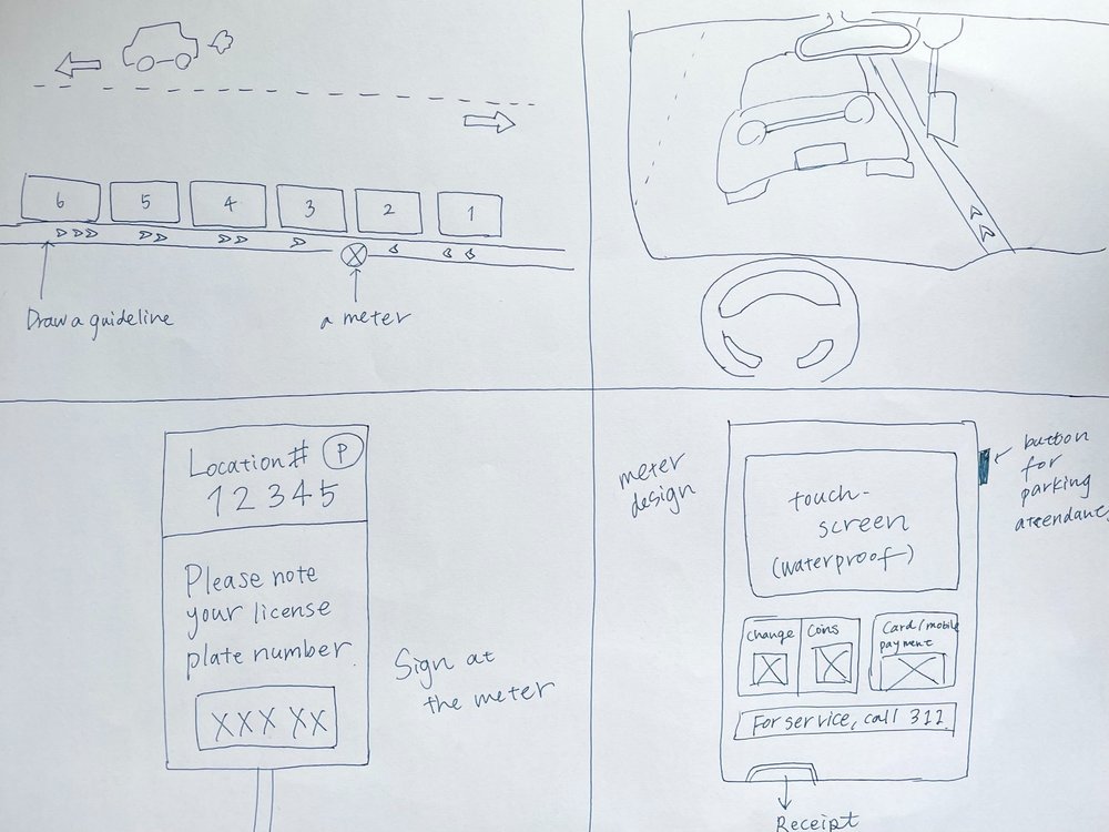
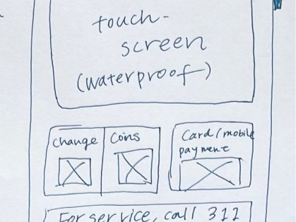
Although the problem 2 is fatal for the product design and user experience, I can only design the touchscreen in this project, so I will just hypothesize that this screen will be a waterproof touchscreen made for outdoor use. So, my problem statement here is;
“How might we make the payment process as smooth as possible for every user?“
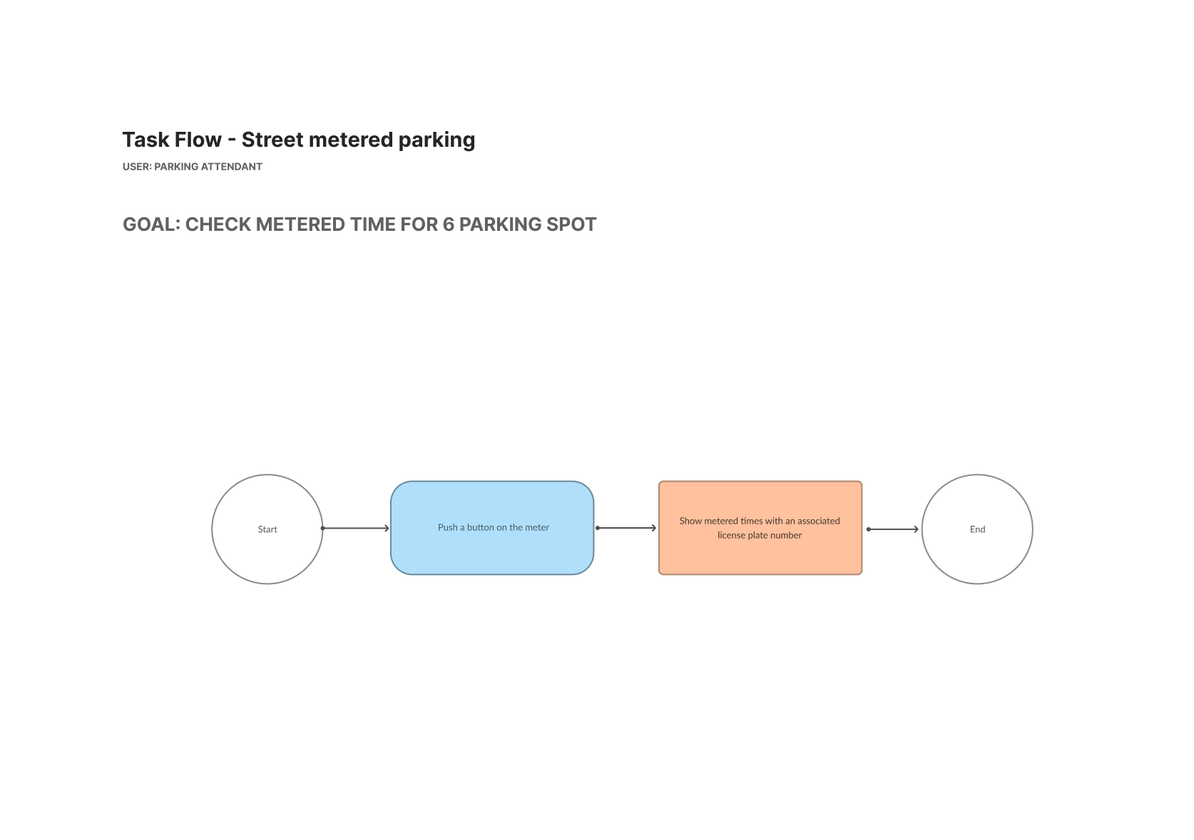
As for the usability of parking attendants, I couldn’t find an interviewee, so I assumed their problems and solutions.
All the problems and assumptions are in this sheet
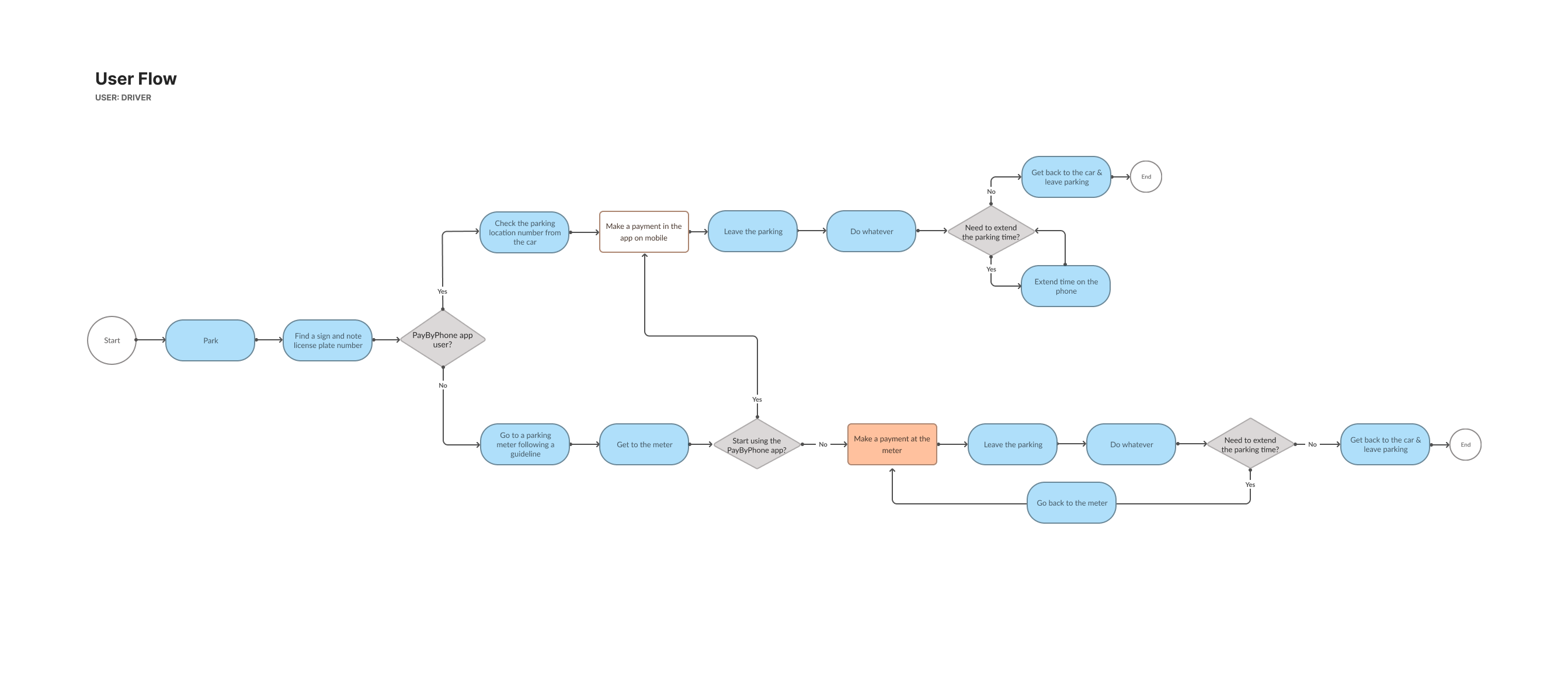
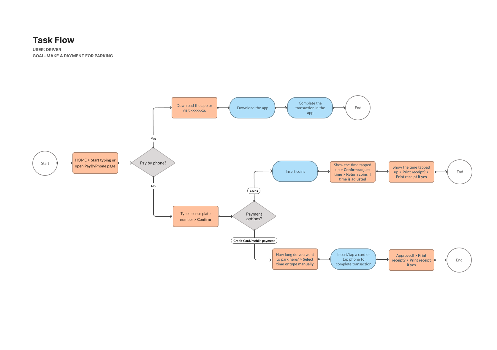
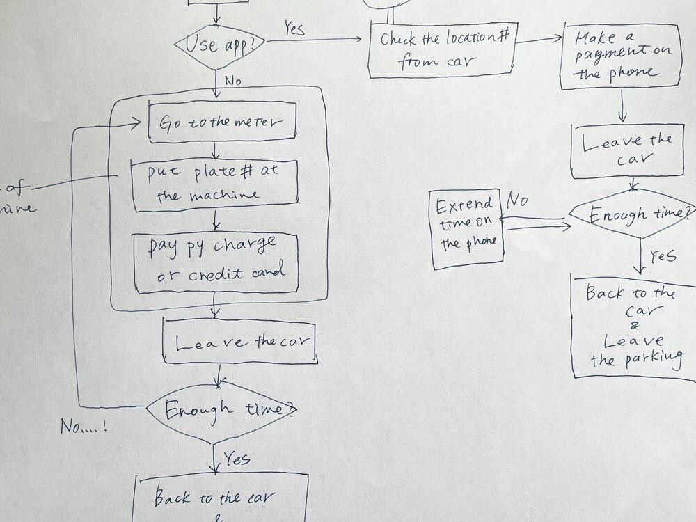
Persona, task flow, user flow
To clarify what kinds of users I’m designing for, I created two personas and developed a task flow and user flow. Since my goal is to make the payment process as smooth as possible for every user, I set 2 personas with different levels of experience with a parking meter.
Mike, 32
He lives in South Vancouver and works as an engineer. He drives downtown every week or every 2 weeks for shopping and often uses metered parking.
Goal: To finish the payment at the meter as quickly as possible.
Emily, 25
She is a novice driver living in a suburb of Vancouver. She has driven downtown but never used a parking meter.
Goal: To make a payment at the meter smoothly even though she doesn’t know how to use a parking meter yet.
4. Usability Testing & Iterate
After creating the first low-fidelity wireframe and prototype, I conducted usability testing on 7 people. And from that, I could gain some points to fix on my design such as
- price is not shown on the screen
- some words are unclear to the user
- the ‘Back‘ button needs to be more noticeable at the payment screen (User Control and Freedom — Jakob’s 10 Usability Heuristics)
So, I went back to Figma and updated the wireframe based on the feedback.
You can see the full data of the usability testing in this sheet
Wireframe explained ― key points
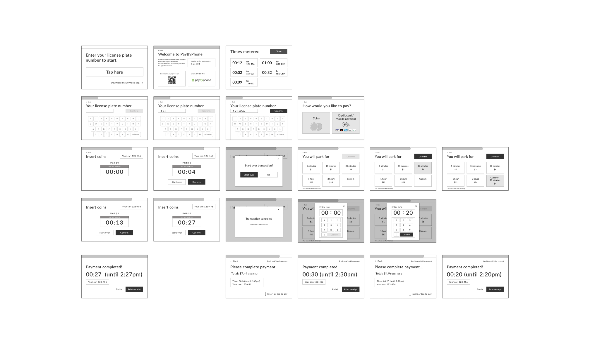
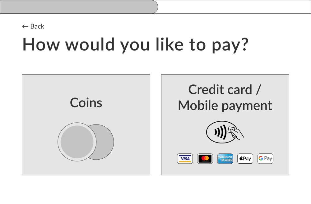
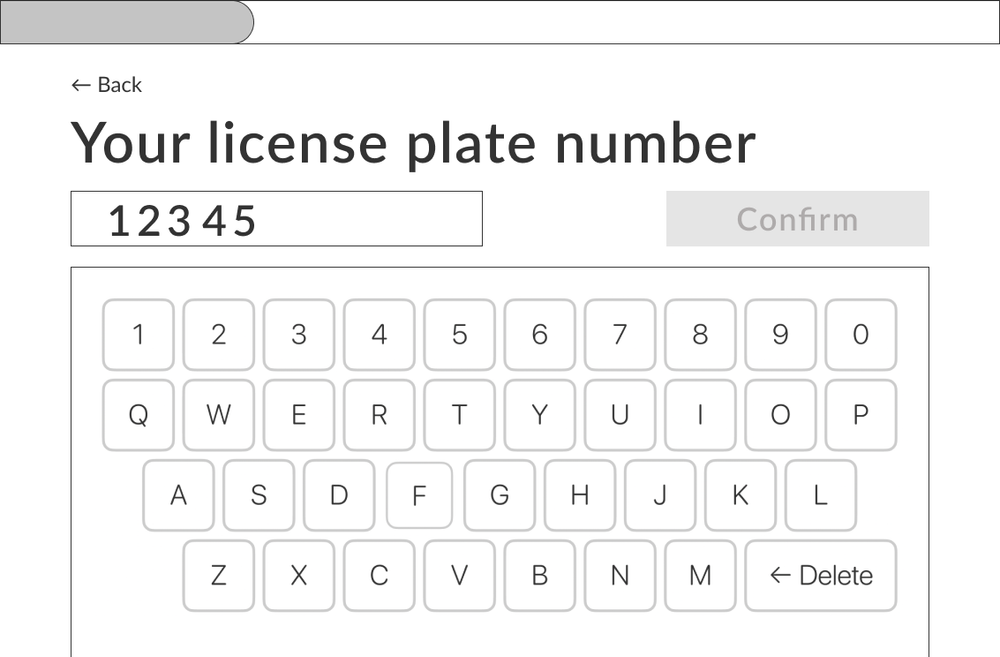
1. Each element is big enough to be seen and touched to be optimized for outdoor use.
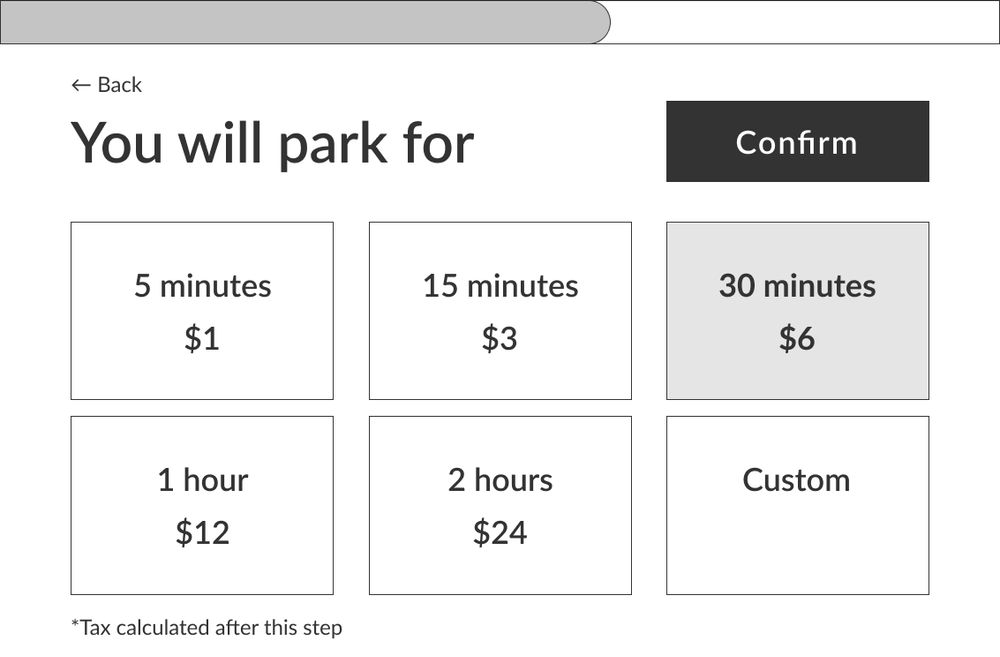
2. It guides users on what to do for each step clearly so that users don’t get lost.
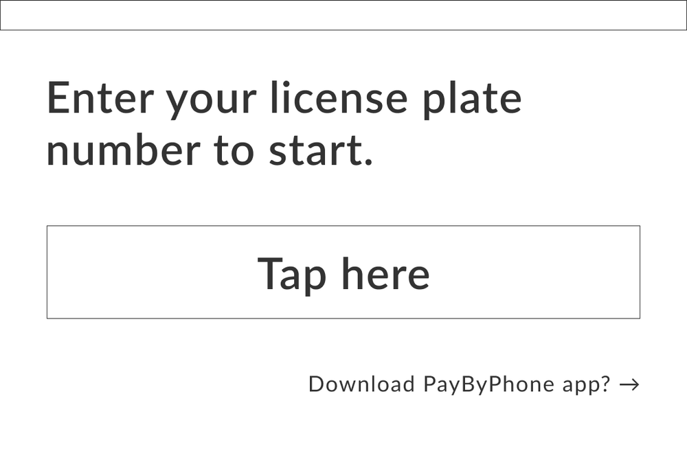
3. Users can use mobile contactless payment like they do in their everyday life. (I make sure this machine is durable for that.)
4. Keyboard is layout just like computer keyboards nowadays so that people can type quicker.
For parking attendant’s use
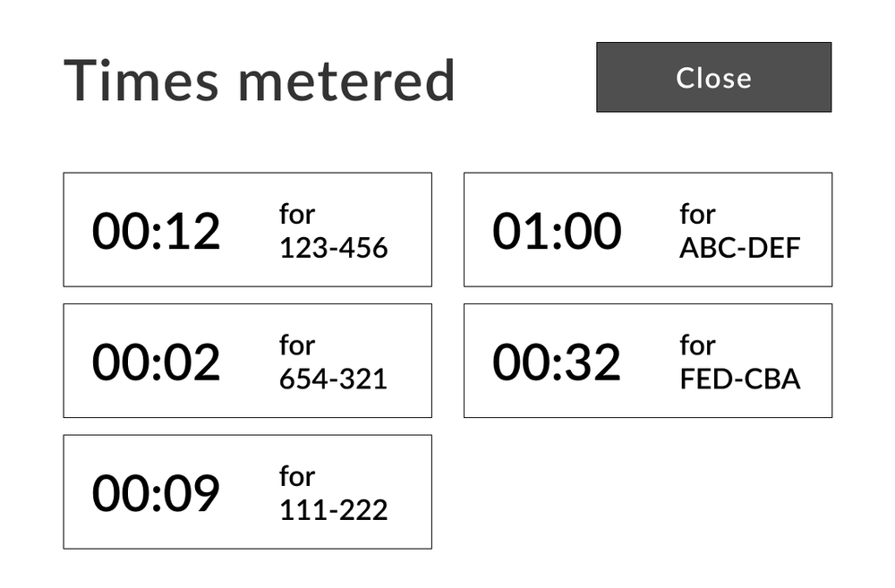
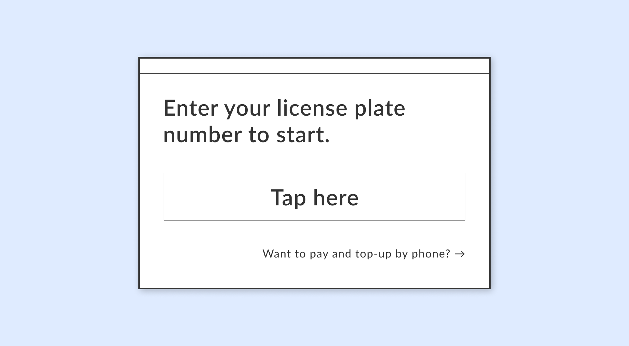
I created this wireframe for parking attendants. They will see this screen right away when they tap a key to the machine so that they can check the times metered in the machine quickly on the screen.
(If I had more time for this project, I would take more time to focus on their usability. Let me know if you know any parking attendants…!)
A quick reflection
I started this project by myself after learning UX for a couple of months at a college because I felt like this was a good opportunity to try out some design methods and challenge myself with designing a product other than for computers and mobile devices.
The most challenging thing for me was that I got to design only the touchscreen while the experience of metered parking includes all other elements such as the parking layout, signs at parking, hardware design of the meter, etc. During the user interview, I even started wondering if a touchscreen is the best solution for parking meters because normal touchscreens can cause some problems of visibility and sensitivity in the outdoor environment. But for this project, I was supposed to design a touchscreen, so I hypothetically decided to use a waterproof touchscreen made for outdoor use and proceeded with the process!
Also, If I had more time and knew a parking attendant person, I would interview them and focus more on their usability…!
And that’s a wrap, thank you for reading!
Happy to hear your feedback, comments, or messages ☺︎
